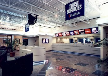
The teller counter is 36 inches high in order to create a more friendly approach. |
Customers who come inside
the bank are treated to a friendly, retail atmosphere. An
open ceiling system provides plenty of vertical space for
hanging the bank's advertising banners. The ceiling's
exposed deck, duct work and track lighting further the
retail image of the bank. The lighting is reflected off
the ceiling's glossy paint finish and the highly polished
floor tile On either side of the central waiting area, two structural columns are treated as architectural features. Big "scoops" that encircle the columns complement the canopy outside and hide incandescent floods that shed even more light on the ceiling. Directly in front of the entrance is a check counter
with back-lit prints that advertise some of the bank's
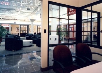
services. At the five teller stations to the rear of the space, Morrill lowered the continuous counter to 36 inches from the standard 40 inches, in order to create a more friendly approach. Another station is still lower in order to offer seated service for handicapped customers. Behind and to the side of the tellers' counter there are more back-lit prints, capitalizing on another opportunity to advertise. Within each of the private offices that line the sides of the bank, Morrill hung artwork that suggests reasons for using the banks services. For example, there are paintings of a house, a boat and a ski vacation, all good reasons for borrowing money. The offices do not have doors to lend a more open and welcoming entry. Windows to the public area and in between each office have black frames with a wood grill inlay painted burgundy. Windows at the front of the bank have the same grill pattern in red, a definite retail feature. |
Doors were eliminated from private offices to enhance the bank's welcoming and friendly atmosphere. Windows in between each office allow natural light to pass from one to the next. |
 for a bright atmosphere. Two
bands of white neon that mimic the neon around the
canopy, plus wall sconces, enhance both the retail image
and the brightly lit atmosphere.
 According to
Morrill, the counter acts as a sort of stop sign for
newcomers who are then approached by a bank employee
offering assistance.