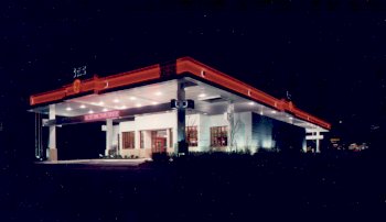
In designing the exterior of State Bank & Trust, architect Stephen A. Morrill borrowed the idea of a canopy over the building from gas station architecture. The canopy provides covered parking, shields drive-up windows, reduces the building's cooling costs and provides ample room for signage. |
If imitation is the
sincerest form of flattery, then gas stations around
Tulsa, OK, should be mighty flattered. From them,
architect Stephen L. Morrill, AIA, principal of SLM &
Associates in Carthage, MO, and Fayetteville, AR, got his
inspiration for the design of a prototype building for
State Bank & Trust in Broken Arrow, OK, a suburb of
Tulsa. The bank, along with a number of others, is part
of the Arvest Bank Group, which is owned by the Walton
family, The idea of a canopy built over the bank building and beyond the perimeter was indeed inspired by the large canopies that are typically constructed over gas stations today. But in the case of State Bank & Trust, the canopy is actually an extension of the one that shelters the bank's drive-up windows. To Morrill, the metal canopy system seemed the best way to reap several benefits from a relatively small expenditure. "There is 10,000 square feet of canopy covering
the bank," explains Morrill. "The canopy covers
The canopy draws attention to itself with two ribbons of red neon that wrap all the way around. At the front and back of the bank, crossbars provide room for neon signage. And on each side of the canopy, the name of the bank and its signature clock are a beacon to all who go by. The canopy rises three feet above the built-up roof of the bank, thereby reducing the cost of maintaining that roof. (next page...) |
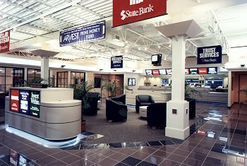
Inside, Morrill created a bright and open atmosphere in keeping with the bank's friendly, retail image. Banners and back-lit prints sell the bank's services. |
 most widely known for their Wal-Mart stores.
Like its cousin Wal-Mart, State Bank & Trust was
always cost and retail oriented. Now, bank management
wanted a new look--inside and out--that would further
strengthen this philosophy. And, says Morrill, they were
not afraid to try something different.
 the drive-up windows, provides covered
parking for customers coming into the bank and reduces
the cost of cooling the building by 10 to 15 percent.
Plus, not only is the canopy a sign in and of itself--who
can miss it!--but it allows for signage on all four
sides."