
| Banking the retail way | |
| A
banker and a store designer believe banks should look and feel more like stores. |
| (...previous page) windows and
no doors, which helps convey key image concepts of
accessibility and openness. The walls of these offices
display lifestyle artwork Showing families skiing,
boating, vacationing - doing things you might have to
borrow money to do. Back outside the offices, in the
center of the retail floor, a waiting area with eight
club chairs allows customers to relax should they have to
wait for a banker. To make waiting customers more
comfortable, the bank offers
|
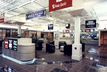
 Because retail bank architect Stephen Morrill believes that bank signage should sell the benefits of products and services, State Bank and Trust is overtly graphic -- strategically placing signs and banners for maximum drama and optimum effect. |
|||
| coffee and fresh popcorn.
State Bank doesn't look like a bank, and it doesn't smell
like one either. Interface Flooring Systems carpet tile defines the octagonal shape of the waiting area and also covers the floors in the perimeter offices. Polished tiles by American Olean fill the high-traffic zone that circles the waiting area. As in a mall clothing store, the ceiling in State Bank is open, to add to the feeling of spaciousness. "We wanted a festive retail ceiling," Morrill explains "We painted the ceiling, the mechanical ductwork, and the bar joists in the offices with a high-gloss white." The lighting maintains the bright, airy feel of the design's intent. Strips of white neon light accent the bases of all the teller desks and the check counters in the waiting area. Metal halide sconces provide uplighting around the room's perimeter. Above the waiting area, low-voltage track lighting allows enough light for reading. |
The bank's two structural
columns include an inverted scoop at the top, which
disguises incandescent uplighting. Next time you're in Tulsa, visit State Rank and Trust and look around for ideas. Careful though, it's not just a bank; it's a store, and you may walk out with a checking account or IRA in a state far from where you live. Mike Fickes writes about business from Baltimore.
|
|||
[Page 1] [Page 2] [Page 3] [Page 4]